TL;DR

Get home appliances delivered free with Prime
- Fast, free delivery on millions of items
- Prime Video, Amazon Music and more included
- Member-only deals all year
A Veranda report gathers designers’ recommendations for pairing chocolate brown with seven colors: jewel tones, dusty pink, off-whites, camel and other warm neutrals, butter yellow, crimson and chartreuse. The designers emphasize warm contrasts and caution against some combinations that are too dark or cool.
A Veranda design report identifies seven colors designers recommend pairing with chocolate brown in home interiors, including jewel tones, dusty pink, warm off-whites, camel, butter yellow, crimson and chartreuse. The advice offers readers ways to use the deep, warm shade across walls, furniture and textiles, while also flagging combinations that may feel too dark or cool.
The recommendations come from designers and paint-industry voices quoted by Veranda. Their shared approach is to use brown’s depth as a grounding element, then choose a companion color that either adds warmth, softens the contrast or provides a deliberate burst of saturation. The report notes that brown can appear in paint, trim, textiles or dark wood furniture, so the palette ideas are not limited to full-room color schemes.
Jewel tones such as emerald, citrine and sapphire are suggested for rich, saturated rooms. Georgia-based designer Grace Brackman recommends a velvet chocolate-brown sofa for this kind of palette, saying the fabric’s sheen can make the color look especially rich. Birmingham, Alabama-based designer Sarah Moore cautions against very dark purples, including some amethysts and aubergines, when their tone sits too close to the brown.
Other pairings create a lighter or warmer counterpoint. Moore says dusty pink can balance brown’s moodiness, while Little Greene creative director Ruth Mottershead recommends warm whites, natural stone hues and warm grays rather than stark white. Atlanta-based designer Liz Williams favors camel over cool gray for a neutral combination. Moore also describes butter yellow as a lively companion, while the report presents crimson as a dramatic accent and chartreuse as a way to make a challenging color feel more approachable.
How These Palettes Shape a Room
The advice matters to readers planning a room because chocolate brown can read as both rich and grounding, but its effect depends on what sits beside it. A lighter or warmer companion can keep a dark wall or substantial piece of furniture from feeling visually heavy; a saturated accent can make the palette more dramatic. The designers’ suggestions give homeowners several ways to adapt the shade to different tastes without treating brown as a single-use neutral.
The report also distinguishes between colors that contrast with brown and those that may compete with it. Warmth and tonal distance recur as practical considerations: a warm off-white softens the boundary, camel brings related warmth, and a light pink offers a softer contrast. By comparison, a near-black purple may lack enough separation, and a cool gray may make brown appear dull, according to the designers quoted.
These are design opinions, not tested rules. A color’s appearance can vary with lighting, materials, finish and the other colors in a room. The report’s examples are best read as starting points for choosing and testing a palette, not as a guarantee that a combination will look identical in every home.
As an affiliate, we earn on qualifying purchases.
Why Brown Is Back in Palettes
The report places the recommendations within a broader design interest in warm, earthy colors. Ruth Mottershead of Little Greene says brown was long dismissed as dated or dull, but she has seen a movement toward earthy shades associated with a connection to the natural environment. She describes a progression from earthy neutrals to the return of brown, including chocolate, caramel and honey tones.
Veranda also points to brown’s flexibility as a reason designers use it. Its depth can contrast with pale neutrals and pastels or bring warmth to jewel and earth tones. Designers cited in the report suggest introducing it through painted trim, rich fabric or dark wood, rather than requiring a room to be painted entirely brown. The source does not provide sales figures, survey results or other quantitative evidence for the reported color trend.
“For a long time, brown was dismissed as dated or dull, but in recent years we’ve seen a clear movement towards warm, earthy colors that help us feel connected to the natural environment.”
— Ruth Mottershead, creative director at Little Greene
As an affiliate, we earn on qualifying purchases.
What the Color Advice Cannot Settle
The report offers expert recommendations, not controlled comparisons or a ranking of the seven pairings. It does not specify exact paint shades, finishes, room dimensions or lighting conditions, all of which can affect how a palette looks. The source also provides no survey data showing how widely designers or homeowners use these combinations.
Chartreuse is included among the seven recommendations, but the supplied source text ends partway through its discussion and does not include the full explanation of the pairing. The report’s complete chartreuse guidance, and any further shades it recommends avoiding, cannot be confirmed from the material provided.
As an affiliate, we earn on qualifying purchases.
Testing the Pairings at Home
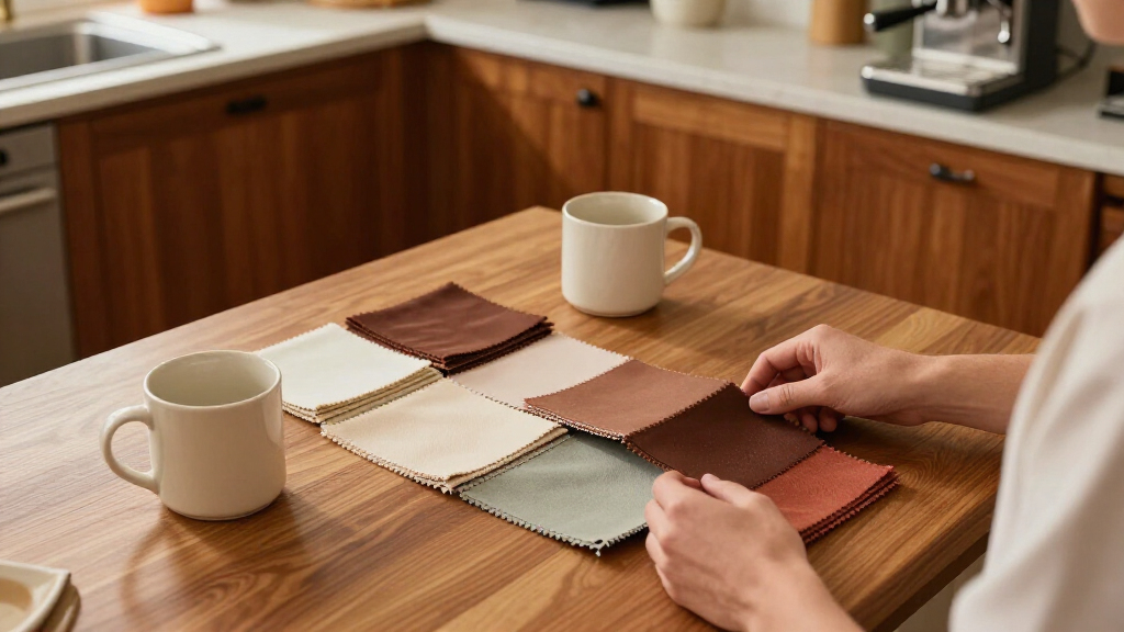
The next step for readers is to translate the broad palette advice into their own rooms: compare sample colors alongside existing flooring, furniture and fabrics, and view them under the room’s usual lighting before committing to paint or large furnishings. The report does not announce a follow-up study, product launch or scheduled design event; it presents the pairings as guidance for planning interiors.
For a practical starting point, readers can choose one role for brown—such as a wall color, sofa or wood finish—then test a companion shade that provides the desired contrast. Warm off-white or camel keeps the palette restrained, while pink, yellow, crimson or jewel tones make a stronger statement. Any final choice remains dependent on the specific shades and materials used.
As an affiliate, we earn on qualifying purchases.
Key Questions
Which seven colors does the report recommend with chocolate brown?
The report lists jewel tones, dusty pink, off-whites, camel and other warm neutrals, butter yellow, crimson and chartreuse.
Which neutral does designer Liz Williams prefer with chocolate brown?
Williams favors camel over cool gray, saying camel’s warmth works better with chocolate brown.
Why does the report recommend warm off-whites instead of stark white?
Ruth Mottershead says stark white can feel cold and create a sharp contrast. She recommends warm whites or natural stone hues for a more harmonious scheme.
Are there colors the designers caution against?
Moore warns that some very dark purples may sit too close in tone to chocolate brown and compete with it. The report also cautions against cool gray neutrals, which Williams says can make brown look dull.
Source: rss
Fall yard work Picks
leaf blowers
As an affiliate, we earn on qualifying purchases.